For the Love of UI Hackathon 2025
Project Context
As part of the FLUI Hackathon, my team and I were challenged to redesign the website for OHME!, a health and wellness brand offering freeze-dried fruit products. Over the course of an design sprint, we collaborated directly with the brand’s founders to reimagine their online presence and improve the e-commerce experience.
Timeline: 4 day design challenge
Team: 4 designers + 1 mentor
My Role & Responsibilities
I contributed to my team’s efforts across all stages of the sprint, including research, UX strategy, wireframing, prototyping, and presentation. I led the lo-fi wireframing activities to establish new layouts and co-developed the final deck, ensuring our design stayed grounded in both user needs and the client’s brand identity.
User Problem Statement
“When I land on the OHME! website, I’m not immediately sure what the brand is about or why their products are worth trying. The visuals feel a bit overbearing, and it takes a long time to actually make a purchase. I wish the communication was a little more clear and I want the shopping experience to be simple and smooth.”
Research Methods & Key Findings
We kicked off the sprint with a:
Site audit to identify usability pain points and visual inconsistencies
A meeting with the owners to establish their goals and possible outcomes
Competitive analysis of e-commerce wellness brands to identify best practices in navigation and product presentation
From this, we found that:
The current site lacked hierarchy and clear CTAs
Product discovery and purchasing required more steps than necessary
Design Solution
We developed low-fidelity wireframes and rapidly moved into interactive prototypes that:
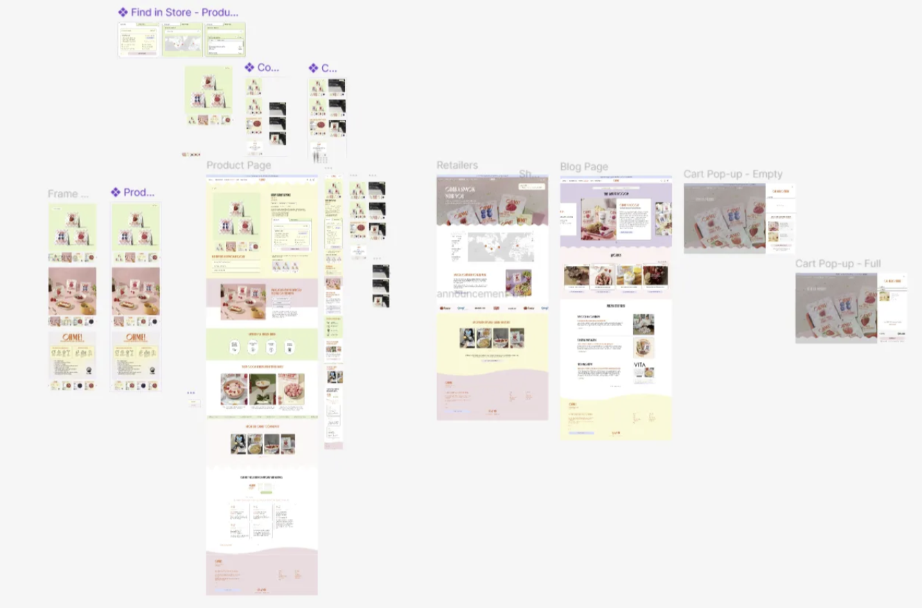
Streamlined the homepage and product pages to improve clarity
Optimized the user flow for purchasing and subscription sign-ups
Created a blog page to create a stronger sense of community to promote sharing within the brand
These changes aimed to increase trust, highlight product benefits, and reduce friction in the path to purchase.
Fig. 1: Summary shot of new high level hi-fi wireframes
Reflection
This was one of the most high-pressure and rewarding projects I’ve contributed to. It pushed me to make fast, strategic UX decisions while remaining empathetic to both user needs and the client’s goals. Working directly with a real brand under time constraints helped strengthen my collaborative and communication skills, especially in aligning stakeholder feedback with design priorities.

