Exploring Functional Areas in Adaptive Information Presentation to Improve Business Intelligence
Project Context
As part of COGS 303, my team and I explored how enterprise reporting systems could be improved by adapting dashboards to the informational needs of different employee roles. Many organizations rely on one-size-fits-all dashboards, often resulting in cognitive overload and poor decision-making.
My Role & Responsibilities
I focused on UI design and layout, with a goal of aligning the dashboard’s structure to each role’s cognitive needs. This included:
Designing clean, modular components adaptable across departments
Prioritizing clarity and readability to reduce visual load
Design Solution
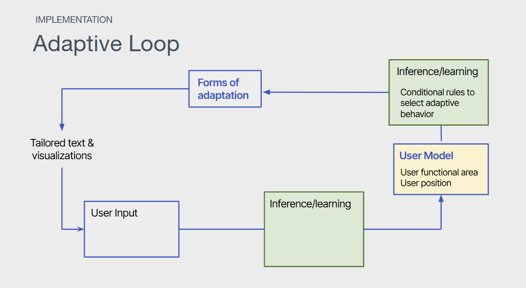
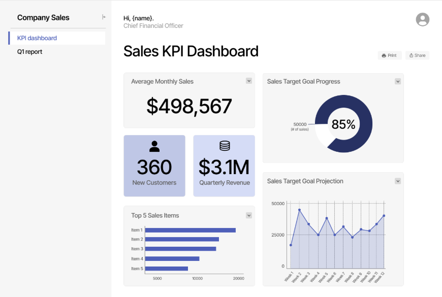
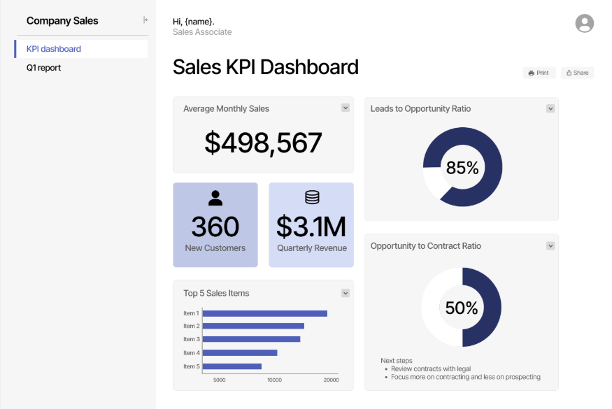
We proposed a web-based reporting system that personalizes information presentation based on a user’s role and department. By integrating adaptive logic into the backend, the dashboard dynamically adjusts the visual hierarchy, data types, and recommendations shown to each user.
Fig. 1: Our adaptive loop sitting at the foundation of the prototype
We created a proof-of-concept prototype and mapped an adaptive information loop to reflect how role-specific inputs would drive the customization of output.
Fig. 2&3: Examples of a Sales KPI Dashboard for (2) a sales associate and (3) a CFO
Outcomes
This project highlighted the importance of role-aware design in enterprise tools. It deepened my skills in UI systems thinking and adaptive design, reinforcing how personalization can improve data comprehension and empower faster, more informed decision-making.
** Updates in progress, more on this case study coming soon!


