
Perception Studios: Personal Project via Google UX Certification Program
Project Context
This project was developed as part of the Google UX Design Professional Certificate on Coursera, and reflects my ongoing growth as a UX designer. Inspired by a fictional art gallery platform, Perception Studios explores how digital interfaces can enhance discovery in the arts.
Timeline: May 2025 - August 2025
My Role & Responsibilities
As the sole designer (and person!) on this project, I was responsible for all aspects of the UX process including user research, journey mapping, wireframing, prototyping, and high-fidelity UI design.
User Problem Statement
Research Methods
Design Solution
Analog Lo-fi Wireframes:
Lo-fi Wireframes in Figma:
“When I try to explore art online, I often feel overwhelmed or like the platform wasn’t built for someone like me. It’s hard to find pieces that speak to me or artists I’d connect with. I want a space that feels welcoming and helps me discover new art without needing to know exactly what I’m looking for, and makes me feel like my curiosity is seen and supported.”
I began with foundational UX research activities to better understand user goals, behaviors, and pain points.
To visualize the user’s journey, I started with storyboards capturing both the big picture and close-up interactions. The big picture frames the overall context of the user experience, while the close-up highlights specific moments of engagement and key touchpoints. These storyboards helped me identify pain points, opportunities, and the core flow before diving deeper into a detailed design.
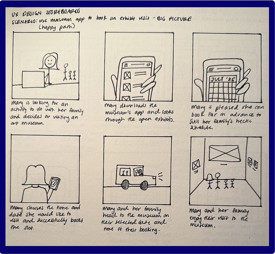
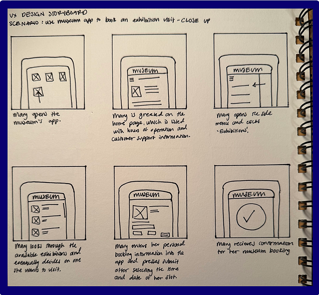
Fig. 1: Big picture storyboard Fig 2: Close-up storyboard
To better understand the flow, I wrote user stories to capture the needs of multiple audience types and mapped user journeys to visualize the end-to-end interaction flow. I analyzed user emotions at each stage to identify points of frustration and moments of satisfaction, which helped prioritize design improvements. This process also highlighted specific areas for enhancement to ensure the design addressed both functional and emotional needs:
Clearer wayfinding
Visual cues for availability
Confirmation feedback.
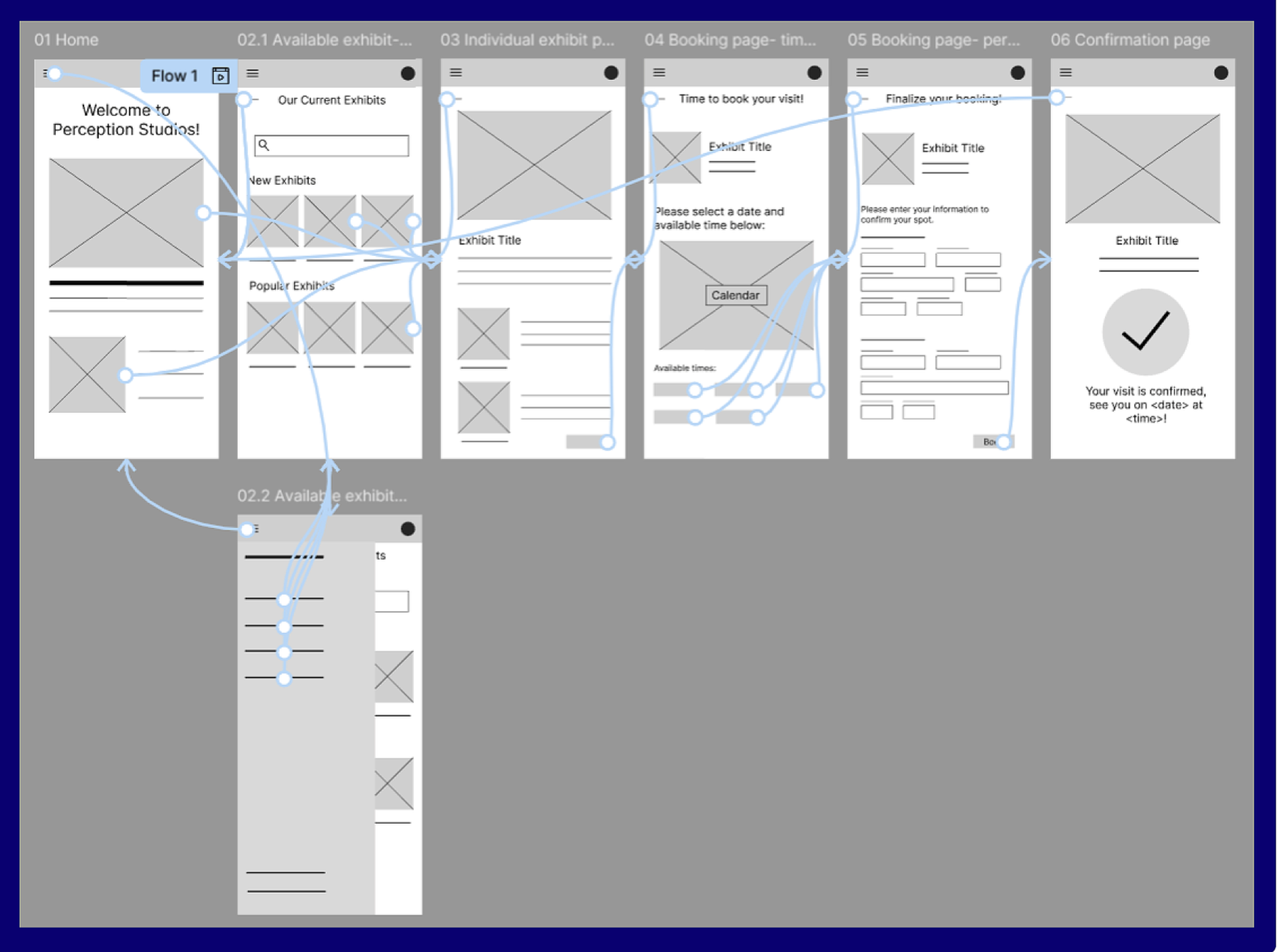
After storyboarding and journey mapping, I mapped out a user flow to clearly define each step in the app experience, visualized in the rough user flow diagram to the left.
This helped clarify how users move between screens, where key decisions occur, and how different pathways connect. By laying out the flow end-to-end, I was able to identify potential friction points, redundancies, and moments where additional guidance or feedback might be needed.
Before translating these flows into digital wireframes, I explored multiple ideas through pen-and-paper sketches. Working quickly and iteratively allowed me to experiment with layout, hierarchy, and interaction patterns without getting attached to any one solution too early in the process.
For each mobile screen, I created five rapid iterations, quickly exploring different approaches to layout, hierarchy, and key features. This rapid sketching process allowed me to test variations in information placement, interaction patterns, and visual emphasis without committing to a single direction too early.
From these explorations, I synthesized the strongest elements into one refined sketch per screen, combining the most effective structural and functional decisions from each version. These finalized sketches became the foundation for my lo-fi wireframes in Figma, ensuring that the digital designs were grounded in deliberate iteration and user-centered reasoning rather than first-pass assumptions.
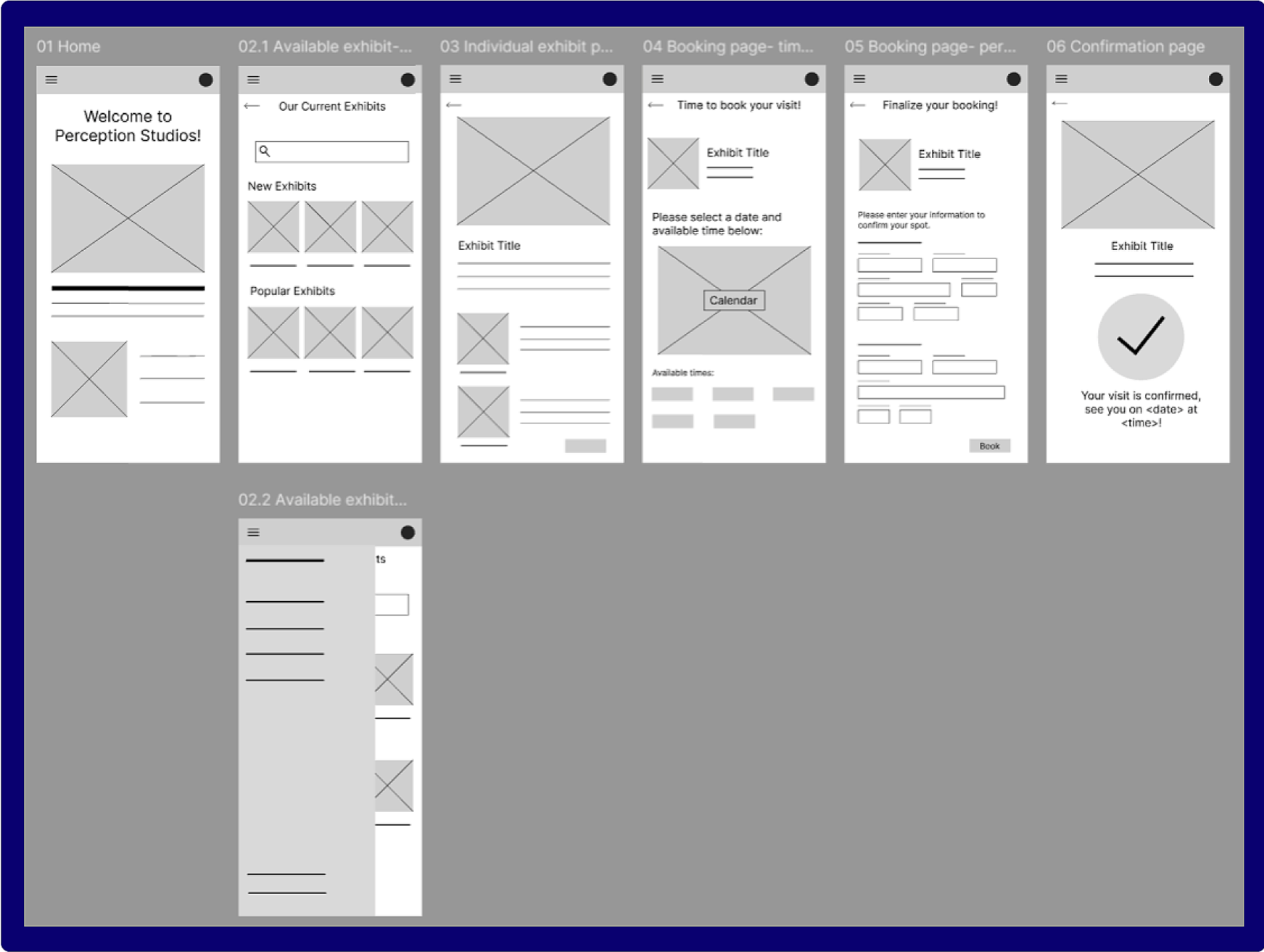
Fig. 6: Pre- testing lo-fidelity wireframes
Initial Lo-Fi Wireframes (Pre-Testing)
I translated my final pen-and-paper sketches into lo-fi wireframes and an interactive prototype in Figma to evaluate structure, content hierarchy, and task flow. These initial designs prioritized functional clarity over visual detail, allowing me to focus on how users would navigate key actions—especially the booking experience.
Usability Testing & Iteration
Because this was a self-driven project, and because of the rapid progression of AI and subsequent integration into our existing processes, I utilize AI-assisted feedback to simulate usability testing and quickly surface potential pain points. Specifically, I used conversational generative AI agents that closely mimic human reflective processes to streamline the design process (helping me stress-test flows, question assumptions, and identify areas of cognitive overload in my first design) rather than to generate or replace the design any of the mocks themselves. This approach allowed for efficient iteration while keeping design decisions intentional and human-led. None of the materials in this project, intermediate or final, were created by AI.
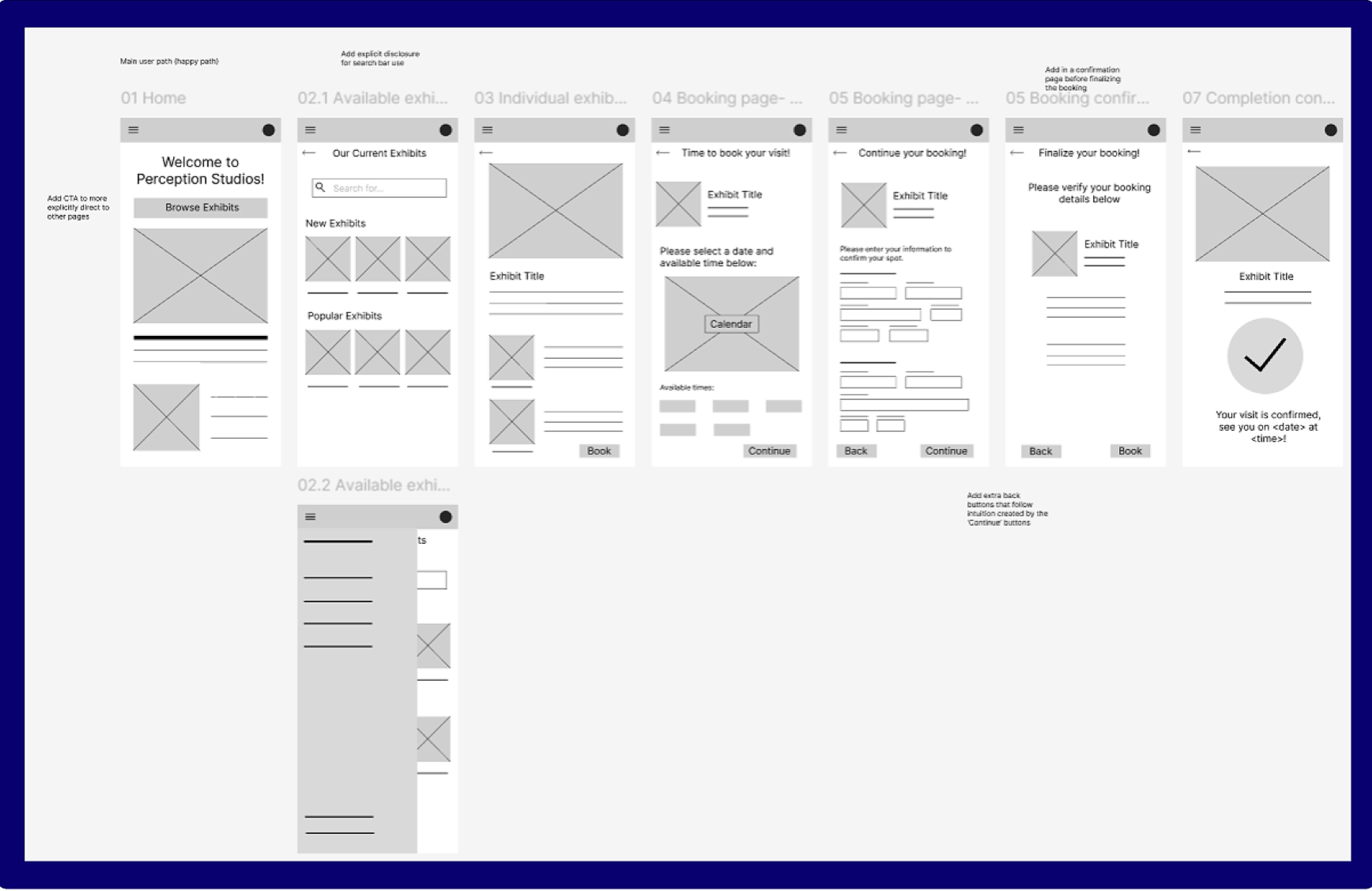
Fig. 8: Post usability testing lo-fidelity wireframes
Hi-fi Wireframes in Figma:
Fig. 11: Close-up of hi-fi main user flow
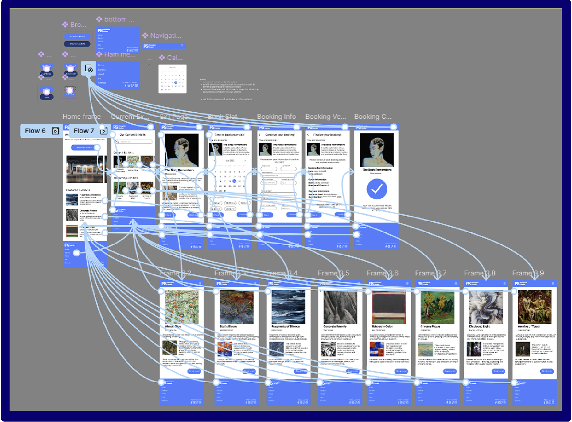
Fig. 10: Full hi-fi prototype overview
Link to the hi-fi prototype here!
(limited functionality per scope of project)
(It’s a lot easier to look at in Figma :D )
Working solo also meant being intentional about feedback. I used AI-assisted critique to simulate usability testing and uncover potential friction points, allowing me to iterate efficiently while keeping design ownership firmly human-led. Rather than using AI to generate solutions, I treated it as a tool for questioning assumptions, identifying blind spots, and refining flows.
Overall, this project reinforced the importance of slowing down to define structure before refining visuals, and of treating iteration as a necessary part of the design process rather than a sign of failure. If I were to take this project further, I would prioritize validating these flows with real users and exploring edge cases more deeply. Still, the process strengthened my ability to think systemically, iterate deliberately, and design with clarity and intention, even within the constraints of a self-driven project.
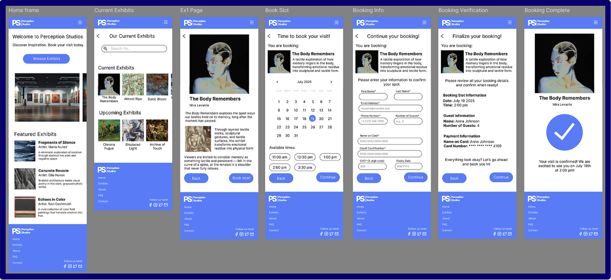
After validating the structure through lo-fi wireframes, I translated the refined flows into high-fidelity screens in Figma. At this stage, I focused on visual hierarchy, spacing, component consistency, and interaction states, ensuring the interface supported clarity and ease of use without introducing unnecessary visual complexity.
The hi-fi prototype brings together all core flows into a single connected system, allowing for realistic end-to-end navigation. This made it possible to evaluate how individual screens work not only in isolation, but as part of a cohesive experience.
The full prototype view (to the left) shows all screen connections and interaction pathways, providing a holistic view of how users move through the app across multiple entry points. This overview was especially useful for validating navigation logic, confirming that key tasks (such as browsing exhibits and completing a booking) could be completed intuitively without dead ends or confusion.
Reflection
This project challenged me to balance structure with flexibility while working independently from start to finish. One of the main challenges was designing without direct access to real users. Without live usability sessions, it was easy to risk designing in a vacuum or over-committing to early assumptions. To address this, I relied heavily on storyboarding, journey mapping, and rapid iteration to test ideas early and often. These artifacts helped ground decisions in user needs rather than personal preference.
Another key challenge emerged around information density, particularly within the booking experience. Early designs attempted to present too much information on a single screen, which made the interface feel crowded and harder to scan. Through testing and iteration, I recognized that clarity mattered more than efficiency at this stage of the flow. Splitting the booking experience into two screens reduced cognitive load, improved readability, and created a more natural progression for users completing the task.
Fig. 7: Pre-testing lo-fidelity prototype connection capture
Fig. 9: Post usability testing lo-fidelity prototype capture
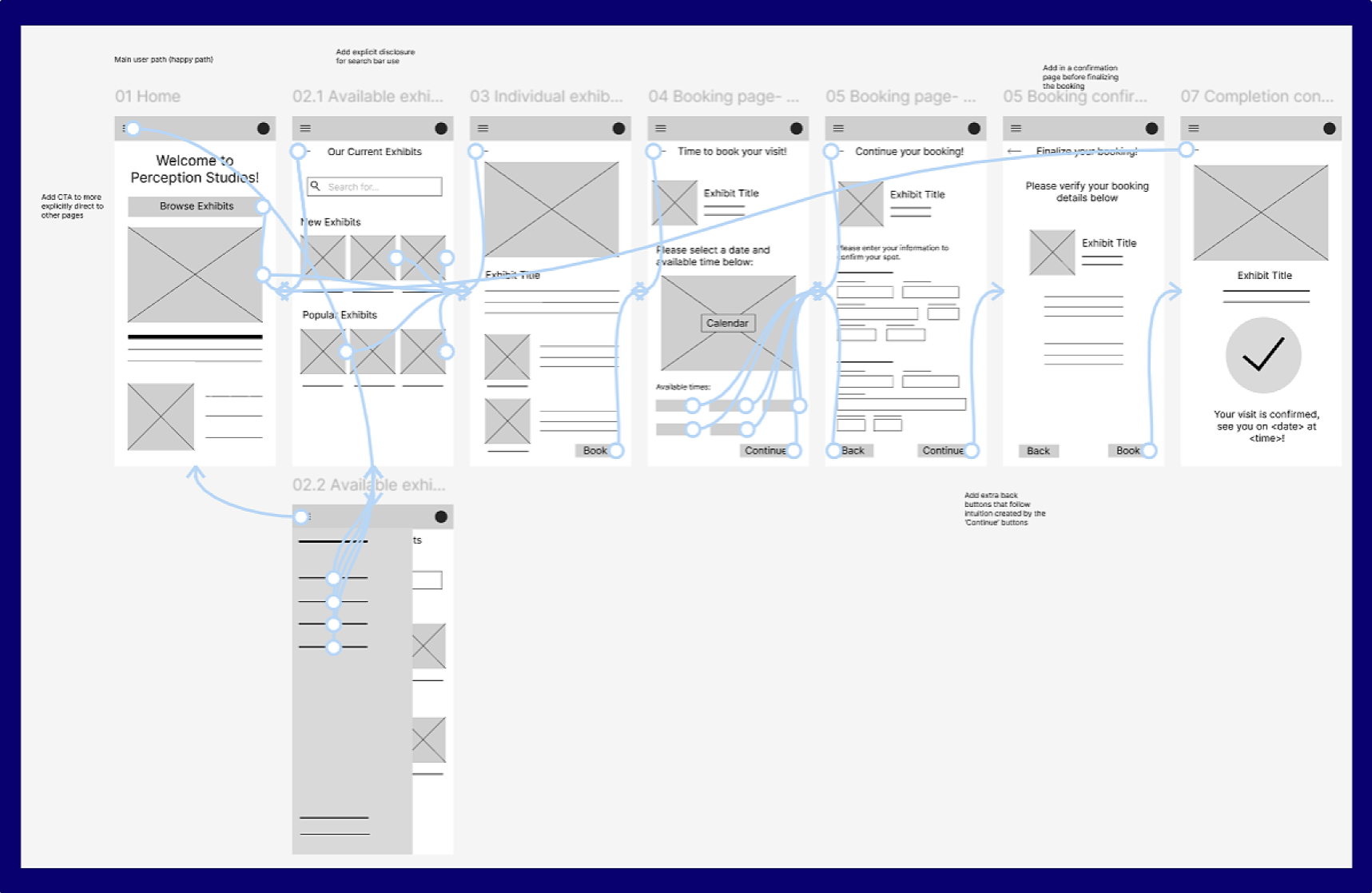
Key Change: Booking Flow Refinement (Post-Testing)
The primary insight from testing was that the booking page felt crowded and difficult to scan when presented on a single screen. To improve readability and reduce cognitive load, I split the booking experience into two distinct pages; a date and time selection page, and a user information gathering page. This change clarified the information hierarchy, improved wayfinding, and created a more logical progression through the task. The revised layout results in a calmer, more readable experience that better supports user decision-making.
(limited functionality per scope of project)
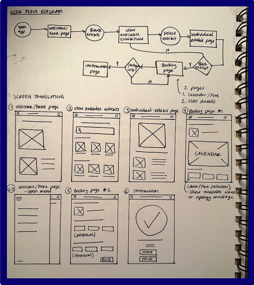
Fig. 4: User flow diagram & initial wireframes
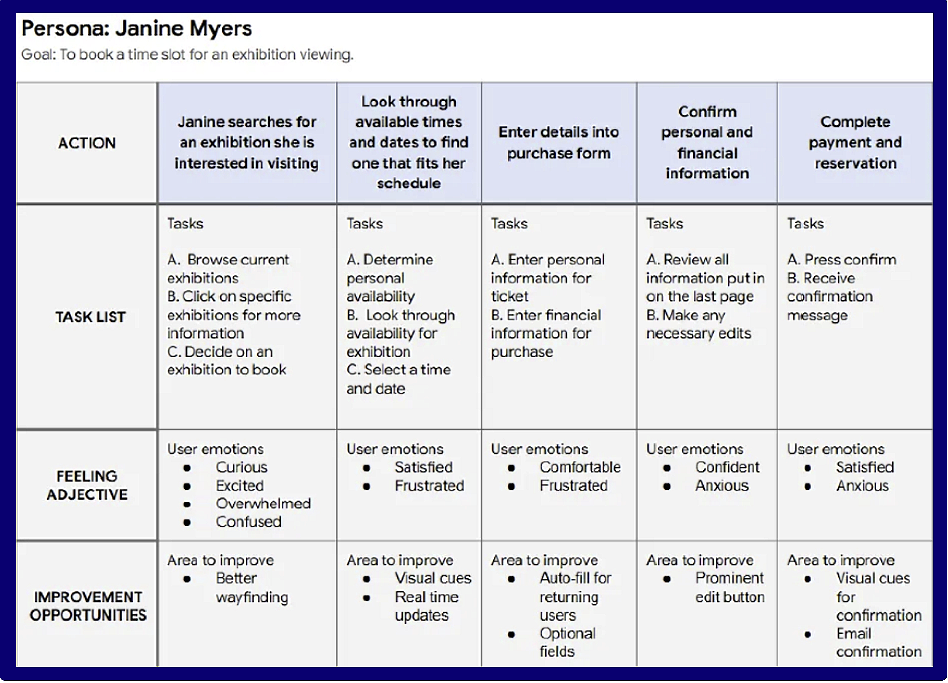
Fig. 3: Journey map for a developed persona
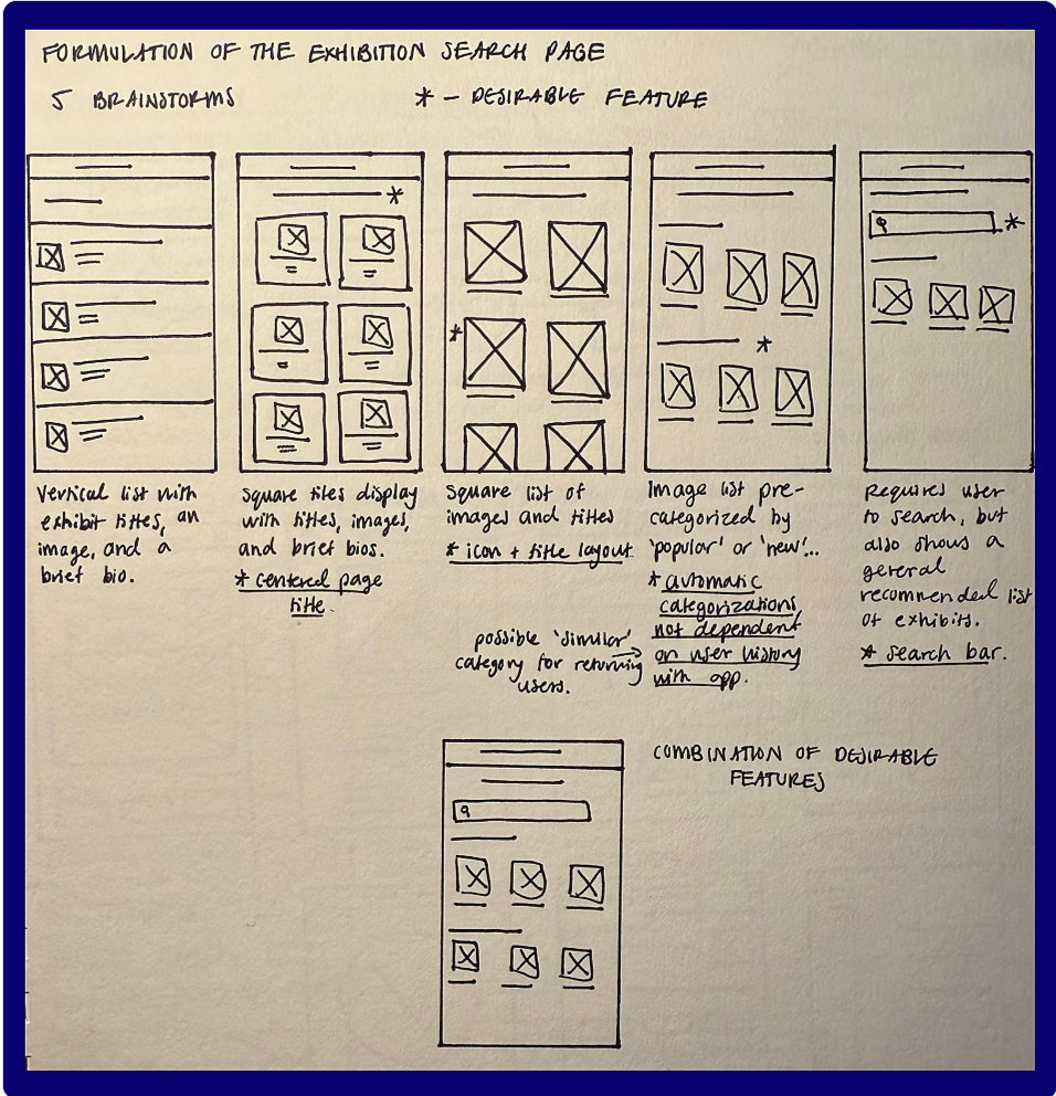
Fig. 5: Process to finding a lo-fi structure